sim·plic·i·ty
noun: the quality or condition of being easy to understand or do.
I am a sucker for simplicity. It is pretty evident from my phone homescreen, which consists of just a single page with the bottom two rows filled with my most used apps. Along with that, on the top there is an At A Glance widget from the Google app just to show me the date and weather info (along with occasional useful reminders). This is all on top of a pretty much blank wallpaper, with Rick and Morty popping out of the portal (wubba lubba dubb dubbzzzz).
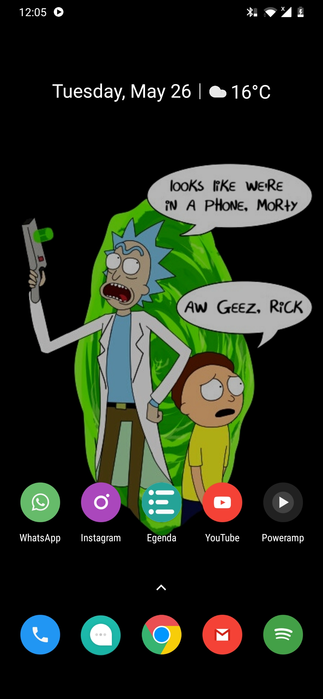
You can look at this and feel like it is empty, but to me, this is perfect. It does everything I want and nothing more. Those apps in the bottom are the ones I frequent the most and they all are placed there for a reason.
It's the little things
There is a reason for the app list to be at the bottom. These app shortcuts are where they are because they are to be accessed easily with one hand. The At a Glance widget is at the top because it's not usually tapped on a lot and hence doesn't need to be in a place with quick access. Rather, the widget needs separation from the other parts to clearly give a spot for the information it provides, which I do frequent a lot to.
As for the wallpaper, it is mainly about the 2 things, I like things to be clear and contrasted. The sharp contrast of the bright and colorful app icons over the black plain wallpaper makes it really easy to spot apps. The black background has other benefits too, my phone (the really awesome OnePlus 6T) uses an AMOLED screen, which turns off black pixels completely, hence it saves power. But most importantly, it is easier on the eyes at night, which since I am a night owl, is a really important thing.
But a fully black wallpaper is, admittedly, boring. Hence, there was the need to have the empty space in the middle to be filled out. I took it as a place to represent the things I am into, which of course is Rick and Morty (which you should definitely watch by the way).
I used to use arch btw
The same thing happens around in my laptop as well, I am using a 14-inch laptop from HP dual booting Windows and Pop OS. I usually use Pop OS for work and Windows just for Windows specific stuff (like some small WinForms projects) and for gaming. Hence, I am not going real deep into my Windows install and I will just be talking about my Pop OS system for describing the way I made it simple.
I just recently switched from my Arch Linux setup which I lovingly call sharkleOS (sharkle being the name I have given to my laptop) with an i3 desktop. I really loved i3 and tiling window managers in general but I found it really difficult to maintain my Arch setup with tons of tiny little issues plaguing my experience. Then one day, like any other Arch user, I messed up while issuing a pacman (Arch's package manager) command and as a result, the entire system went into the gutter. This eventually led me to Pop OS with it's stable Ubuntu backbone and awesome Pop Shell (a tiling window manager) over GNOME, which gave me a balance over tiling windows and floating windows when needed added with the awesome GNOME integrations.
Now, to my coding environment, I usually work on Postwoman these days which is a Nuxt app along with some small personal Python scripts and some small Node.js apps and scripts. I use Neovim as my text editor with my own configs to tweak it to my taste. Neovim runs on kitty (my terminal of choice). My typical work environment looks like this.
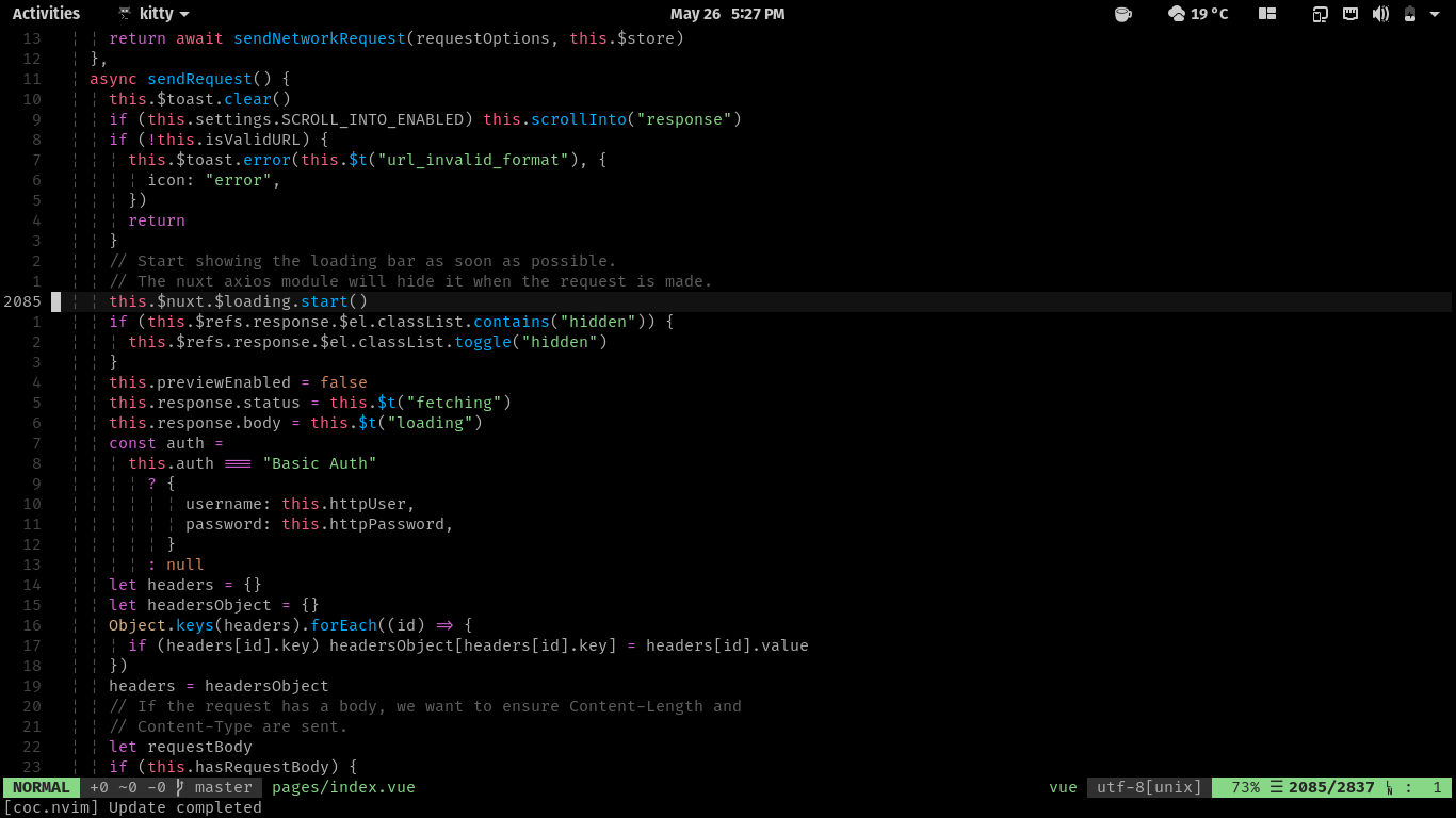
You can see basically many characteristics from my phone homescreen repeating on the Vim side of things. Mostly the minimal stuff on screen and the black background. Both of these being borrowed for about the same reasons. When I code, I want the most space on screen dedicated to the actual code I am working on, with only the most relevant info allowed to take space.
"Do one thing and do it well"
The above is a well accepted statement summary for the Unix philosophy. I don't believe an app should exactly be only doing one thing (atleast in terms of high level tools), but I do believe that apps should have one clear focus. But in one screen, the app should indeed only be having one goal. I think the most relatable example for this is the most visited web page in the world, https://www.google.com/ .
The Google homepage looks really simple, it just has the company logo, a text field and 2 buttons, one is a clearly marked "Google Search" button and then the "I'm feeling lucky" button to quickly jump to the first result. To a person, this may look like the absence of design, but I believe, this is the perfect design for a search engine. It allows for a single thing, which is to take search input and direct to the results and that is pretty much the main operation of that page. Nothing more and nothing less. It gives the page an almost Zen like feeling, the only thing presented to you is the search box and there is (for the most part) nothing to distract you from it. There are many other benefits from this as well, one for example, is that the page is so tiny that it loads pretty much instantly.
One page = One Intent
I believe, a page should only be defined and given UI to do one thing, to express one intent. Your search engine input page shouldn't contain additional toggles and images to distract the user from the main intention of the page, this keeps your pages focused and to the point. This helps the user get stuff done, the user might even not realize the extent to which you have designed the page to simplify that one intent. But the user will find your tool reliable. It also makes it obvious to the user about what they need to do.
I try to bring the same stuff into this blog as well, in this page, you would have some info at the top like the date and time to read, then the title and then the content. They are then followed by the buttons to navigate to the next post or previous entries. All the extra intentions are still in the reach of the user, but it is tucked away in a appropriated Hamburger Menu on the top. This keeps the user focused in the intention of the page, which is to show the blog contents to the user, which I know has worked because you are reading this right now.